07/10/2013
SAKSA automation logo design
Logo colour would be blue, style industrial and an additional symbol was not needed: a “no nonsense” logo could be created relying on typography....
Logo colour would be blue, style industrial and an additional symbol was not needed: a “no nonsense” logo could be created relying on typography....
The logo symbol depicts a stage-wise spiraling explosion of bulb, leaf, bud or bloom of a flower in a calibrated spectrum of colours....
The Wilde logo is technically complex, lines are balanced to allow for printing in very small sizes but also to show subtle detail when reproduced in very large sizes....
Tartu Ärinõuandla (Tartu Business Advisory Services) logo design with an abstracted A symbol like a propeller suggesting dynamic synergy....
[vc_row row_type="row" type="full_width" icon_pack="font_awesome" content_menu_fe_icon="arrow_back" text_align="left" padding_top="20"][vc_column][vc_column_text]This is a laconic logo design with the symbol simply repeating text, yet fully suitable to position the company in the international fresh, processed and frozen fish industry. It is a good example of a small company who is determined...
Lorem ipsum dolor sit amet, consectetuer adipiscing elit. Nam cursus. Morbi ut mi. Nullam enim leo, egestas id, condimentum at, laoreet mattis, massa....
[vc_row row_type="row" type="full_width" icon_pack="font_awesome" content_menu_fe_icon="arrow_back" text_align="left" padding_top="20"][vc_column][vc_column_text] Salutaguse is a new commercial, industrial and residential development south of Tallinn. The architectural and landscaping solution is planned to be ecological and built around the footprint of the previous manor house and existing well-established trees of the park. As...
[vc_row row_type="row" type="full_width" icon_pack="font_awesome" content_menu_fe_icon="arrow_back" text_align="left" padding_top="20"][vc_column][vc_column_text]Classical Sweets wanted to establish a brandmark for handmade chocolates and asked Emajõe Disain to suggest a selection of possible brand name. We agreed that the brandmark would be in calligraphic style, so I suggested brand names with letters having...
[vc_row row_type="row" type="full_width" icon_pack="font_awesome" content_menu_fe_icon="arrow_back" text_align="left" padding_top="20"][vc_column][vc_column_text] A logo design was needed for the promotion of reconstruction of the Tartu Kivisild stone bridge which was destroyed during WWII. As the stone bridge no longer exists, I decided to find a view of the bridge which would...
[vc_row row_type="row" type="full_width" icon_pack="font_awesome" content_menu_fe_icon="arrow_back" text_align="left" padding_top="20"][vc_column][vc_column_text] As an extension of the company name, I included ‘integrated expertise’ in the logo design as a conceptual explanation of the business idea. This is reflected in the symbol stretching from genetics to agriculture biotechnology. Symmetry found in the company...
Lorem ipsum dolor sit amet, consectetuer adipiscing elit. Nam cursus. Morbi ut mi. Nullam enim leo, egestas id, condimentum at, laoreet mattis, massa....
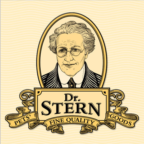
[vc_row row_type="row" type="full_width" icon_pack="font_awesome" content_menu_fe_icon="arrow_back" text_align="left" padding_top="20"][vc_column][vc_column_text] Dimela (now Dimedium) planned to introduce a range of pet foods which would have to compete with the long-established market leaders - but we would not have the huge adverting budgets of the well-established multinational pet food brands. The...
Lorem ipsum dolor sit amet, consectetuer adipiscing elit. Nam cursus. Morbi ut mi. Nullam enim leo, egestas id, condimentum at, laoreet mattis, massa....
Stiliseeritud põllumajanduslooma sümbol meenutab karja põletusmärkide tegemiseks kasutatud raudu....
Logo peegeldab Võru maakonnale nii iseloomulikku rulluvat maastikku, see on loodud Rõuges tehtud visandite ja panoraamfotode põhjal....
Lorem ipsum dolor sit amet, consectetuer adipiscing elit. Nam cursus. Morbi ut mi. Nullam enim leo, egestas id, condimentum at, laoreet mattis, massa....
[vc_row row_type="row" type="full_width" icon_pack="font_awesome" content_menu_fe_icon="arrow_back" text_align="left" padding_top="20"][vc_column][vc_column_text] The name of the hotel came from the dragon ornaments on the building, so for the logo design, this dragon element was combined with the D character. Because gothic script was already used extensively on the facade signage so...
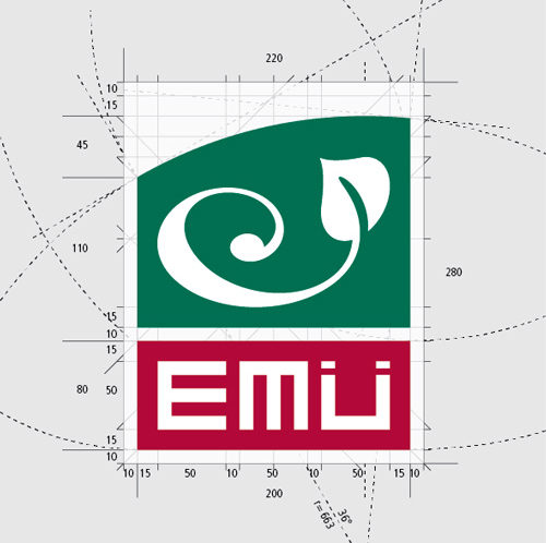
Sümboli ümber on roheline pind, mis ülaservas kaardub – viide maakerale ja keskkonnale – justkui tahtes oma ruumist välja tungida, mis on viide ülikooli püüdele ulatuda Eestist kaugemale ja EMÜ rollile rahvusvahelistes teadusringkondades....
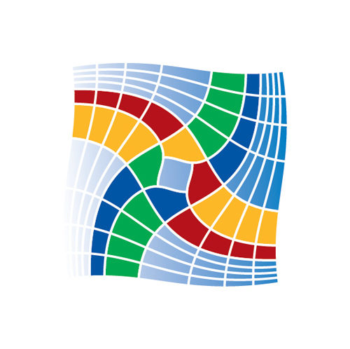
[vc_row row_type="row" type="full_width" icon_pack="font_awesome" content_menu_fe_icon="arrow_back" text_align="left" padding_top="20"][vc_column][vc_column_text]The “Inspiring Clusters” conference logo was designed to be used in 3 possible formats. The colourful and energetic symbol was used widely throughout a variety of conference materials (invitations, folders, presentations backgrounds, banners etc). [/vc_column_text][/vc_column][/vc_row]...