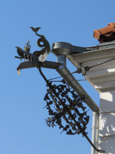
The name of the hotel came from the dragon ornaments on the building, so for the logo design, this dragon element was combined with the D character. Because gothic script was already used extensively on the facade signage so was also used in the logo design.
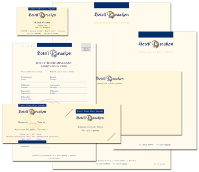
While the central D letter has been greatly embellished, legibility has been retained.
Designed as a two – colour logo (with the yellow or gold also used for stars), the logo also functions perfectly as one colour blue.
A coordinated range of printed materials we designed as part of the corporate visual identity.