When the company named “Nõo Meat Factory” asked me for a logo and brandmark design in 1999, I pointed out my immediate concern that words “Meat Factory” were not very appetising from a marketing perspective. I proposed that by changing the word “Factory” to “Prince” it would be much more appealing as a retail brand. The brand name works best in the Estonian language because of the play on the words ‘prince’, ‘sausage’ and ‘spices’. The inclusion of royalty and retro in the brand concept immediately opened up directions for packaging design, individual product names, product photography, advertising and point-of-sale promotion.
When I made the formal presentation of the new brand name and brandmark to the employees, there was an immediate positive reaction and a new common direction was established within the company. In effect, by changing a few letters in the company name, not only was a completely new brand promise was made to the public, but also, there was a new found pride within the company and an agreed target of highly demanding quality standards.
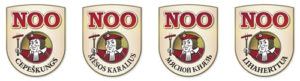
Playfulness in the brand name is continued in the brandmark design with the playing card style illustration of the jolly prince ‘vürst’, breaking out of the heraldic frame to offer the satisfying product.
Over time the logo has been translated for neighbouring markets: Latvia, Lithuania, Russia and Finland.