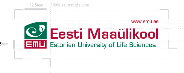
What does the EMÜ (Estonian University of Life Sciences) logo symbol represent?
A literal meaning of the symbol should not need to be defined verbally – it relies on the language of symbols and each person can see what the want in the combination of e, spiral and leaf symbols. Over time it will come to represent Eesti Maaülikool. However, if the symbolism must be explained, then it may be pointed out that the spiral is an “ancient symbol of the goddess, the womb, fertility, continual change, and the evolution of the universe”. To reflect life sciences the spiral has been styled to suggest a sprouting seed. A spiral is a naturally dynamic shape and the efficient lines of the symbol lend it further depth and energy. The symbol is framed in a green space which is curved at the top; perhaps a reference to the globe or the environment – yet the symbol seems to be trying to break-out of this space; perhaps a reference to extending beyond “Eesti” and the role of the university in the international scientific community.
The style attempts to be contemporary – modern without trying to be fashionable so as to give the symbol a long lifespan. The design borrows on typographical treatments and glyphs which have been long in existence, implying an organisation with a heritage – yet not a classical arts and sciences university, rather a forward-looking university embracing technology for a new era.
In addition to changing the name in 2005, the university adopted the new logo designed by Emajõe Disain. An extensive CVI manual was prepared to explain how the new visual identity should be used throughout all associated organisations. A complete inventory of print materials and signage was made and these were replaced during the year or implementation.


