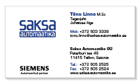
Saksa automation is an industrial engineering company and authorised partner of Siemens. When deciding how to approach the logo design, I decided that it should closely relate to the design principals of the Siemens corporate visual identity. Logo colour would be blue, style industrial and an additional symbol was not needed: a “no nonsense” logo could be created relying on typography.
By combining upper and lower case letters, the logo plays on the symmetry either side of the letter K. The sub-title “automation” continues the play on upper and lower case letters in a monotonous machine-tooled font style.
Print materials included the Siemens logo and followed precisely the Siemens corporate visual identity guidelines.