
Via Hanseatica promotes a tourism route through the Baltic states. This made it more challenging than designing an identity for one particular area or country.
The solution departed from the recommendations of the clients marketing plan. The plan prescribed a shopping-list of specific elements to be included – yet, when I explained my logic they could see that it was the right way to go.
Concept: an invitation to travel a road and explore … what is over the bridge, across the hills and beyond the borders? Literally: a road entering and passing through the Baltic States.
I felt it was necessary to show geographically the route being promoted. It is a conceptual solution based on the shapes of the Baltic States from the perspective of people in central and western Europe. Rather than illustrating some particular attractions, I chose to leave what is to be discovered to the viewer’s imagination. A flat rolling landscape is suggested. The device of the various planes of colour is used to suggest distance so as not to be so location specific.
The soft wave of the symbol is reflected in the specially drawn playful typeface – a more formal typeface would make it too corporate. The logo is clearly in the style of tourism logos.
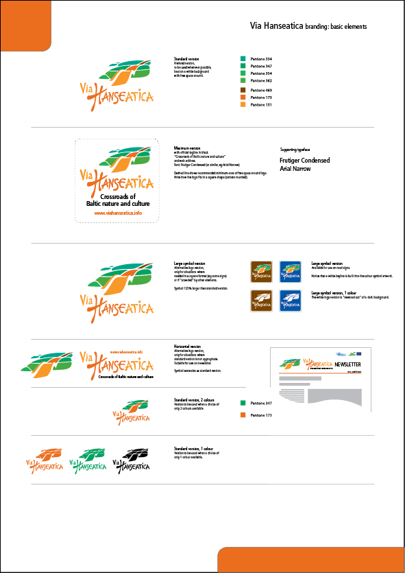
Logo usage guidelines were drawn up for the coordinated implementation of promotional materials, road signs and signs at objects of interest along the route.