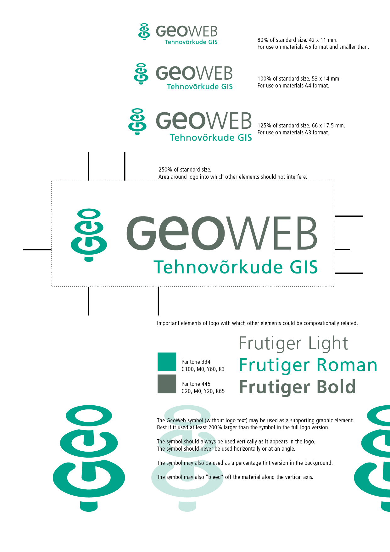
When discussing the logo design brief, the client explained their product in terms of interrelated layers of data points making up maps of underground infrastructure. We agreed that a symbol should include layers, but other than that, it was up to me to make a design proposal for a distinctive symbol.
The symbol converts GEO into a monogram, which, depending on how you look, can read either as a three-dimensional vertical marker or as a flat series of rings with perspective into the distance. The visual puzzle makes it stick in the mind as the brain tries to interpret semiotics.
The symbol itself is echoed in the typography of the logo. Upper and lowercase letters are combined, and in fact, the letter “G” is the letter “e” turned and modified. A tag-line to the logo specifies very efficiently the area of expertise.


