VitaMIN – promotional brochure design
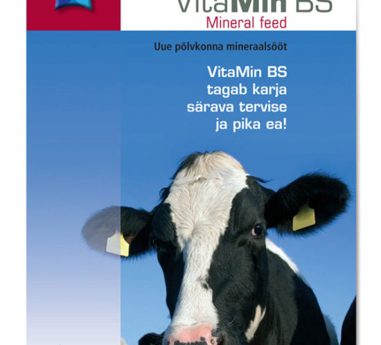
12 page brochure is an overview of the VitaMin BS range of animal mineral feeds, including an interesting 3D diagram showing the annual life-cycle spiral of a dairy cow and calves....
[vc_row row_type="row" type="full_width" icon_pack="font_awesome" content_menu_fe_icon="arrow_back" text_align="left" padding_top="20"][vc_column][vc_column_text]This is the flagship product of the häamuna range and is the most exclusive packaging of Estonian eggs. During research on egg packaging, Emajõe Disain found the producer of this new, innovative “iMagic” egg carton design and häämuna chose...
[vc_row row_type="row" type="full_width" icon_pack="font_awesome" content_menu_fe_icon="arrow_back" text_align="left" padding_top="20"][vc_column][vc_column_text]The packaging design for Dr Stern was originally intended for products for cats and dogs. I never expected to design a package for rabbits and hamsters but it was straight forward to extend the branding and pack family with...
[vc_row row_type="row" type="full_width" icon_pack="font_awesome" content_menu_fe_icon="arrow_back" text_align="left" padding_top="20"][vc_column][vc_column_text]The packaging of Nõo sliced meats has been redesigned, and evolved over several phases since first designed by Emajõe Disain in 1999 – design updates normally coincide with improvements of packaging technology at the meat factory. Packaging materials and...
[vc_row row_type="row" type="full_width" icon_pack="font_awesome" content_menu_fe_icon="arrow_back" text_align="left" padding_top="20"][vc_column][vc_column_text] The packaging graphic design for the Type 405 flour simply continues the established style of Kalew packs, from the 1990’s but adds a full-colour photo of a bakery and flour still life to indicate higher quality than the standard...
[vc_row row_type="row" type="full_width" icon_pack="font_awesome" content_menu_fe_icon="arrow_back" text_align="left" padding_top="20"][vc_column][vc_column_text]Tartu Veski (now renamed as Tartu Mill) introduced a new rye flour product and needed a pack graphic design solution. In keeping with the style with other products in the Kalew range, a still life composition was created on...
[vc_row row_type="row" type="full_width" icon_pack="font_awesome" content_menu_fe_icon="arrow_back" text_align="left" padding_top="20"][vc_column][vc_column_text] Several years ago I designed a logo and visual identity for Sangaste Rukkimaja guesthouse. Now the client wished to introduce it’s own brand of Rye Vodka and needed packaging for this colourless liquid. To keep printing costs down we...
[vc_row row_type="row" type="full_width" icon_pack="font_awesome" content_menu_fe_icon="arrow_back" text_align="left" padding_top="20"][vc_column][vc_column_text]Emajõe Disain has designed a wide variety of packaging for Grillon BBQ range of charcoal products. In addition to the typical bags of charcoal, the client wanted to introduce a "convenience” product of ready-to-light cassette bags. The bags are...
[vc_row row_type="row" type="full_width" icon_pack="font_awesome" content_menu_fe_icon="arrow_back" text_align="left" padding_top="20"][vc_column][vc_column_text] A series of 4 varieties of rice with multiple elements on the pack facade communicate the product. A transparent strip at the sides displays the rice, and a scale to help measuring rice was smartly combined with the non-printing...
[vc_row row_type="row" type="full_width" icon_pack="font_awesome" content_menu_fe_icon="arrow_back" text_align="left" padding_top="20"][vc_column][vc_column_text]A characteristic of the Dr Stern packs is a horizontal strip showing the pack contents - in the case of quarts cat litter this strip becomes a transparent window showing the actual product. The window has been shaped as...
[vc_row row_type="row" type="full_width" icon_pack="font_awesome" content_menu_fe_icon="arrow_back" text_align="left" padding_top="20"][vc_column][vc_column_text] Meveda produces a range of speciality honey, each with a characteristic taste related to the dominant flowers within range of the bees. The three main types were envisaged as a gift pack of flower pollen dust, royal jelly, and...
[vc_row row_type="row" type="full_width" icon_pack="font_awesome" content_menu_fe_icon="arrow_back" text_align="left" padding_top="20"][vc_column][vc_column_text]This detergent for work clothes uses a simple graphic device of covering the pack with denim stitching. Advantage is taken of the short brand name which allows is to appear big and bold. Strong blue and orange “industrial” colours...
[vc_row row_type="row" type="full_width" icon_pack="font_awesome" content_menu_fe_icon="arrow_back" text_align="left" padding_top="20"][vc_column][vc_column_text] This range of low cost pasta would compete well on price - so the design objective was to create a pack fitting with the mainstream pasta packs. For example, typical past colours are used. The pack design is closely integrated...
[vc_row row_type="row" type="full_width" icon_pack="font_awesome" content_menu_fe_icon="arrow_back" text_align="left" padding_top="20"][vc_column][vc_column_text] This vegetable oil would compete well on price - so the design objective was to create a pack fitting with the mainstream packs. Product feature "call-outs" are clear and simple on the front, with technical details on the side. The brand...
[vc_row row_type="row" type="full_width" icon_pack="font_awesome" content_menu_fe_icon="arrow_back" text_align="left" padding_top="20"][vc_column][vc_column_text] This very large 50 Liter bag containing extra large charcoals is targeted at professional chefs. The black charcoal background is contrasted by the evenly glowing burning charcoals.The Grillon brandmark colours of orange, black and green are carried through the...
[vc_row row_type="row" type="full_width" icon_pack="font_awesome" content_menu_fe_icon="arrow_back" text_align="left" padding_top="20"][vc_column][vc_column_text] For the range of flour mixes, the packaging design extended the style of Kalew packs, with a full-colour serving style photo to clearly indicate the specific type of product. Photo composition for the series introduces a common curve and colour-coded...
[vc_row row_type="row" type="full_width" icon_pack="font_awesome" content_menu_fe_icon="arrow_back" text_align="left" padding_top="20"][vc_column][vc_column_text] This is one of my very early pack designs in Estonia yet is still a favourite. Designed in 1997 it closely follows the basic formula of the original Bembi pack. The original was so harsh it looked more like some...
[vc_row row_type="row" type="full_width" icon_pack="font_awesome" content_menu_fe_icon="arrow_back" text_align="left" padding_top="20"][vc_column][vc_column_text] This design project began with generating a new brand name specific to the Estonian market for fresh eggs. Eggs are interesting products to brand and package. For such a basic product, the packaging really just has to protect, legally must...
[vc_row row_type="row" type="full_width" icon_pack="font_awesome" content_menu_fe_icon="arrow_back" text_align="left" padding_top="20"][vc_column][vc_column_text] The packaging was designed in 2001 to be a "generic" sugar brand. This generic brand was so successfully anonymous that it became the typical photo choice for journalists when reporting on the issue of Estonian sugar and the EU. A...
[vc_row row_type="row" type="full_width" icon_pack="font_awesome" content_menu_fe_icon="arrow_back" text_align="left" padding_top="20"][vc_column][vc_column_text]This surgical equipment washing powder package does not need to compete on the supermarket shelf. The pack design only needs to give a visual hint as to its purpose and then provide clear technical information on how to use. Four...