This design project began with generating a new brand name specific to the Estonian market for fresh eggs.
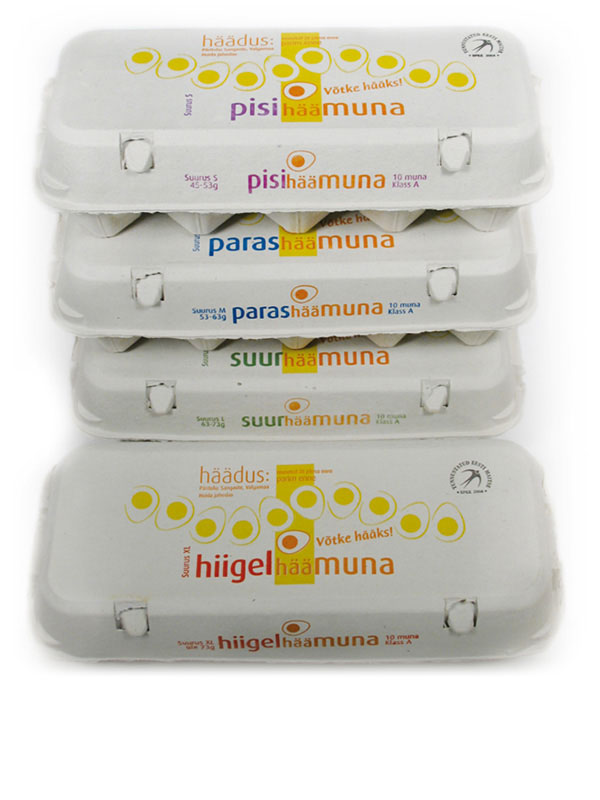
Eggs are interesting products to brand and package. For such a basic product, the packaging really just has to protect, legally must carry the word “egg”, and one of the few distinguishing characteristics is egg size. The customer tends to look for honest goodness and believes that yolk colour is an indicator of taste quality.
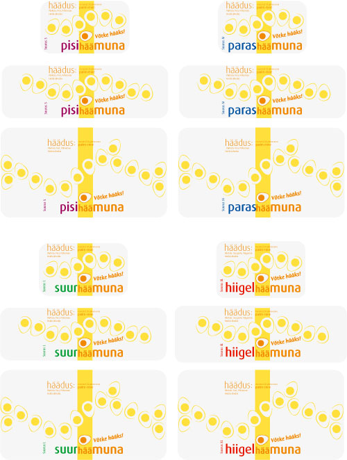
“hää” (colloquial “good”) was proposed as the anchor of the branding solution as it has all the right associations. The brand name “häämuna” meaning “good egg” was registered as a brandmark. This “hää” combined with size and the word egg then resulted in a brand family: “pisi-, paras-, suur-, hiigelhäämuna” meaning “small, just right, big and really big” as extensions of the brand name. The directness of this solution suggests a reliable product and this simplicity was extended to the egg symbol of the hää brandmark.
The brand family was colour coded and pack design carefully took into account how many packs would appear together on the supermarket shelf. Only 3 colour printing is needed for each pack, thus keeping costs down and allowing for printing solid colours on the rough egg carton recycled cardboard.
Printing area on the carton is limited and typical egg pack design solutions create frames to the edges – häämuna avoids this, making use of white space for a clean effect, and allowing pack sizes of 6, 10 and 15 eggs to match each other closely.