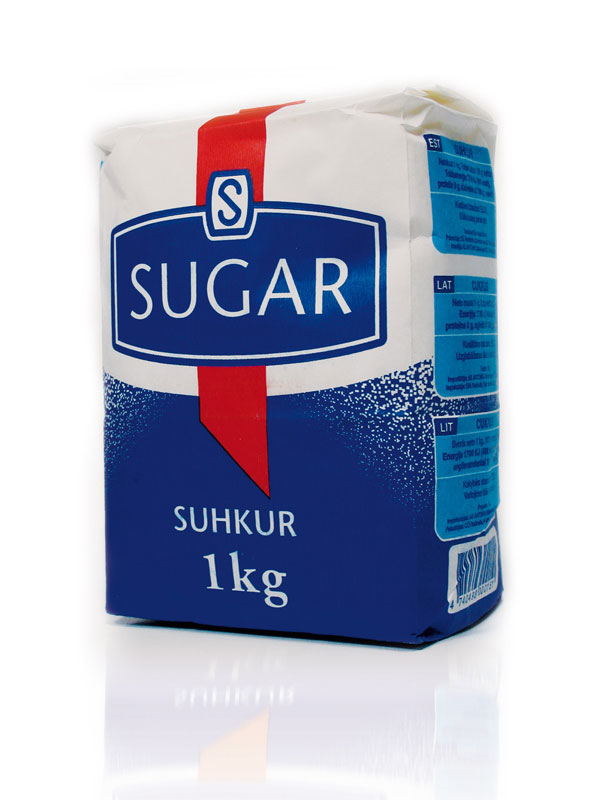
The packaging was designed in 2001 to be a “generic” sugar brand. This generic brand was so successfully anonymous that it became the typical photo choice for journalists when reporting on the issue of Estonian sugar and the EU.
A fictitious brandmark of a stylised “S” anchors the generic product name on a red vertical band which “seals” the pack folding – the actual producer’s name appear only in the address. Strong use of colour and contour makes this pack work very well in repetition on the supermarket shelf. The bulging shapes of the design extend around the corners to add volume. Visual clues of a sugar grain pattern render the design language neutral, while the sides carry 6 Baltic, Nordic languages.
Designed for very cheap, simple 3 solid colours printing and allowing for loose (fast, low waste) calibration during the packaging process.