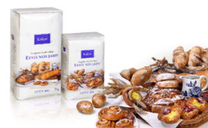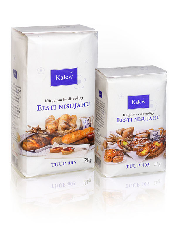
The packaging graphic design for the Type 405 flour simply continues the established style of Kalew packs, from the 1990’s but adds a full-colour photo of a bakery and flour still life to indicate higher quality than the standard Kalew flour range.
The 2001 pack design was updated in 2007 with a more sophisticated photo and minor upgrades to other pack design elements. In 2001 the photo suggested “purity of ingredient”. The 2007 version has moved on to the “sweet joy of cooking”. Different photo compositions were used on each pack.
Photography by Meelis Lokk. Photo direction and composition by Michael Walsh. Photo composition took into account how the composition must fade to white and wrap around the corners of the pack. Blue highlight elements in the photo composition were chosen to match with the blue of the Kalew brandmark.