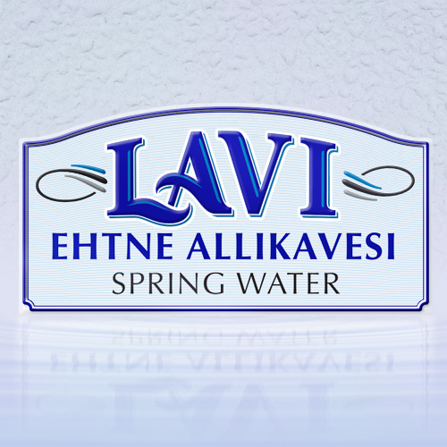
LAVI spring water brandmark
Lavi is the location of natural springs in Lääne-Viru County, Estonia, famous since ancient times for having restorative and healing qualities. Water from the natural springs has been organically filtered by permeable rocks, mineralised by limestone, and cleaned by sandstone.
The Mölder family have been farming at the site of the springs for many years and now wished to share naturally pure and unprocessed Lavi water. Very conscious of environmental issues, Tiiu Mõlder at Lavi Vesi, researched and concluded that packaging in 5-liter plastic pouches would be much better rather than in many small plastic bottles. Whatever the packaging method, a brandmark would be needed – and it must be a brandmark strong enough to compete with the very many existing local and multinational consumer water brandmarks.
Knowing that the packaging would be a non-standard pouch type, I decided that it would be important for the Lavi brandmark to be strongly within the established genre of bottled water brandmarks. This would clearly identify the type of product even though the packaging form is unusual.
When designing the LAVI mark, to compensate for the gap between the letters “LA”, I found a method to overlap the typography of these letters, lending the idea of water flow to the brandmark. Also, the client wanted me to use Estonian flag colours and this fitted well with water, so a discrete caligraphic element was added on either side of the very short brand name – allowing balance with added to wider Estonian and/or English text underneath. Knowing that the packaging would be printed on a silver base material, I planned for overprinting some of the blue colours directy on silver (for a resulting reflective effect) and to allow for the flag colour white to remain unprinted as reflective silver. The upper curve on the “label frame” element would help to add visual volume to the pack, and play together with the irregular curved volume of the filled pack.
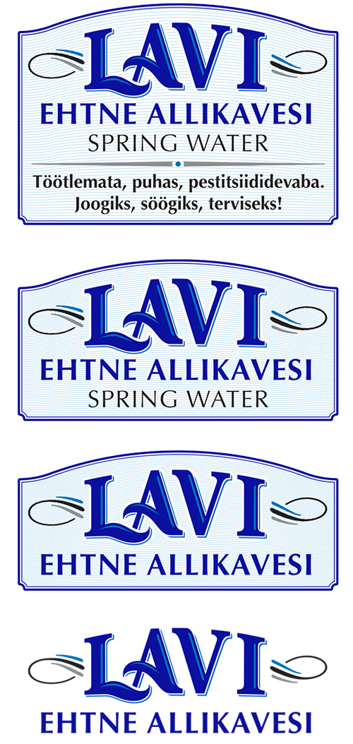
For flexibility of usage, the final artwork for the brandmark was provided in 3 different variations with the “label frame” element, plus a version without a frame.


