LAVI spring water pack design
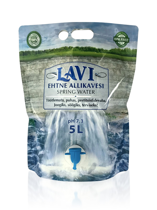
Because this water pouch packaging form is new and unfamiliar, so the pack graphics must immediately communicate “convenient, fresh, flowing water”. The central “label element” with brandmark and text, is a very deliberate reference to the established genre of labels on bottled water. Behind this, a photomontage was created to suggest how rainfall on the landscape of the Pandivere highlands is filtered through layers of limestone and emerge as the natural flowing spring at Lavi. The limestone cross-section works as a natural texture background for the label. Water gushes from behind the Lavi label, highlighting the product/pack special feature of the tap dispenser – this graphic design solution also clearly suggests “how-to-use”. Pack graphics make this unfamiliar product instantly understandable. Carry handles are simply isolated in the watery sky background, inviting to pick-up and try.
The actual, unprinted pack is a highly reflective silver material. 6 colours were available for gravure printing on LDPE plastic. To print a CMYK image, then first it would need to be under-printed white. One additional solid Pantone colour was available, and this was used for the blue brandmark lettering. By creating knockouts in the under-printed white mask, the blue was overprinted directly on the silver making the blue very reflective, eye-catching. In other selective places there was no printing ink and the silver material reflected directly, giving the impression that an additional silver foil may have been used.
The stand-up 5 Liter pouch is an excellent choice for packaging water, not just for environmental reasons, but for cost-effectiveness too. The pouch uses only a fraction of PET material compared to standard PET bottles and uses much much less energy in production and distribution. In summary, the pouch has the lowest carbon footprint of any PET package for water.
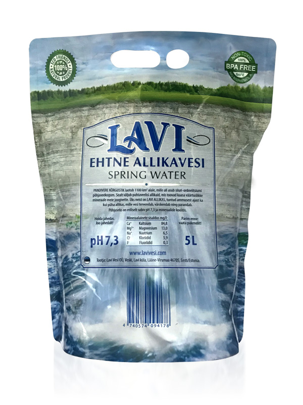
The pack design took into account how the pack would bend and bulge when filled. The reverse of the pack simply repeats the wrap-around panorama, the central “label element” with brandmark is extended vertically to carry additional product details. Instead of the tap dispenser on the front, the barcode in dark blue, discreetly mimics the falling water. Because of the strong edge-to-edge horizontal lines of the design, the packs work very well together when placed side-by-side on the shop shelf.
The overall clarity and simplicity of the graphic design reinforce the message that this is a “pure and natural” product.