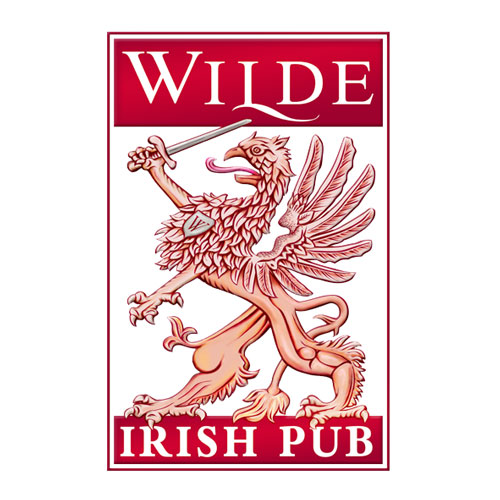
The Wilde brandmark design is technically complex, and the lines are balanced to allow for printing in very small sizes but also to show subtle detail when reproduced in very large sizes. The letter W has been bastardised (yes, a typographical term for changing original character design) to resemble the letter V – a reference to how the Estonian language does not distinguish between the letters W and V. On the letter L a calligraphic swish has been added, which is later used as part of the branding language for treatment of sub-brands.
The gryphon, mascot of printers have long associations with the location of the pub in the first printing house in Estonia. The printing theme in the café extends to a literary theme in the pub where the name is a play on Oscar Wilde and the Estonian author Eduard Wilde. The gryphon used by Wilde is based on a version once extensively used in the region of Livonia (today southern Estonia and northern Latvia).
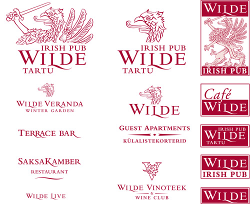
The basic brandmark was also made into a wide range of coordinated marks which could be used in different reproduction situations and also to add depth to the branding. The brand itself was adapted as new Wilde services were added.


