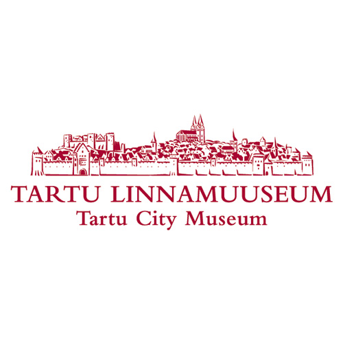
Rather than choosing a single historic detail as a symbol, the whole ancient city of Tartu has been included in the logo design, suggesting a richness of variety within the old walls.
Combined from a variety of sources, and with the expertise of historians, a detailed view of medieval Tartu has been created. The roughness of the woodcut style recognises that this is an approximate reconstruction.
Created as a one – colour logo for economy, the line weights have been calibrated to allow for filling of detail when printed in very small sizes.


