The Julie Clarke logotype is an apparently simple typographical design solution in the style of perfumes and cosmetics branding.
While a Roman all-caps font is used, a comma mark, turned and placed over the I converts it into a lowercase letter or candle reference.
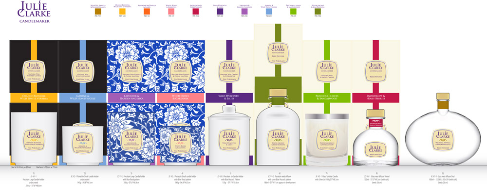
The oval lozenge frame around the logotype is the same basic shape as labels on products and packs. The curved shape visually adds volume to the cylindrical product. These are handmade products, so the curved shape also helps to mask any small misalignment of the label.