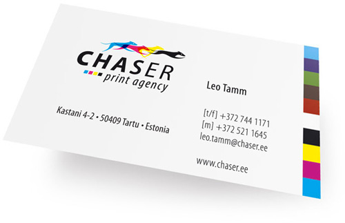
Chaser was a fun logo to work on, for a design literate client with a good excuse for sophisticated printing. The logos of printers often play on the 4 basic process colours: cyan, magenta, yellow, black (CMYK) and variations when over printed as spot colours. The client wanted to use a greyhound symbol, so I broke the unusual running style of the greyhound down to the 4 distinct phases and assigned each a colour.
While stylising the greyhound I was also careful to make it anthropologically correct so that a Flash animation could easily be made by moving the body and legs in multiples of 5 or 15 degrees to create a running dog.
Various weights of the Frutiger font have been used to counter balance colour and lend movement.