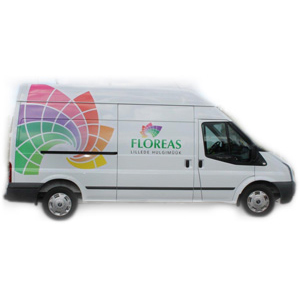
Floreas is an international wholesale distributor of flowers based in Tallinn, Estonia and it needed a logo update. I agreed with the client that the logo needed to be full colour, while various one colour versions must also be possible. The company did not need so many printed materials and there is no cost saving from limiting colour usage on the web.
The logo symbol depicts a stage-wise spiralling explosion of bulb, leaf, bud or bloom of a flower in a calibrated spectrum of colours. Timing is important in this business.
The inclusion of white grid lines allows the symbol to transfer well when used as a single colour logo, whether positive or reversed out of a colour – the symbol seems to spiral into the vortex of the letter O. The 3 languages in the logo subtitle suggest the international nature of the business.


