Eesti tõlk on vaja.
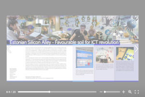
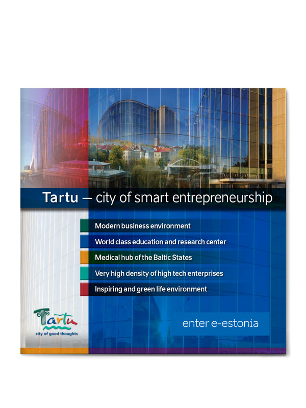
Tartu City Government wanted to update the promotional brochure (the first version was designed and written by Emajõe Disain in 2003 and updated every few years). The original design formula of photomontage on the top of the page was retained, photomontages were either updated or new versions created and the format was changed to square.
The vibrant colours of the Tartu logo are used on the front cover to highlight summary messages of content. In the body of the brochure, a different colour theme is set for each page spread and this is carried through the photomontage. Each page spread includes some specific case studies of enterprises in Tartu, while the photo montage at the top is a good way of showing many aspects of the city in a dynamic way.
Even if the brochure is not read fully from cover to cover, a casual flip through the pages and main headings visually communicate the message of a dynamic, innovative and vibrant city.