Eesti tõlk on vaja.
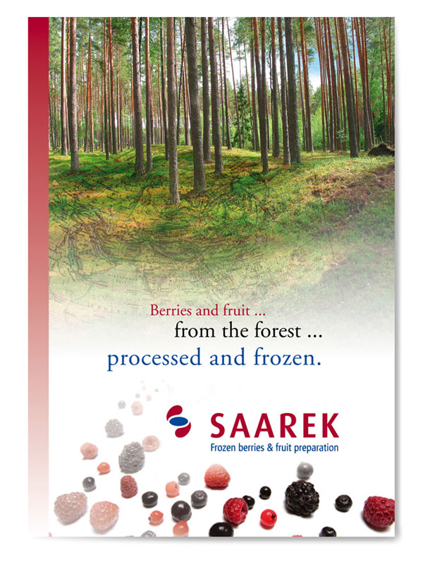
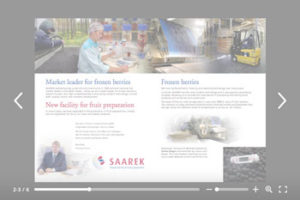
In addition to the design of a logo and visual identity for Saarek, I also designed a company profile brochure for the frozen fruit and berries food ingredients producer. We agreed to make a very wide (8400 x 100 mm) photomontage of the high-technology production process from forest to final product. This was used on the top of a 3 x A4 gate-fold-out brochure. (Presented below as regular A4 facing pages.)
The text was kept deliberately short (to increase the chances of it being read) the presentation relies on headings with several simple clear messages to the industrial buyer.
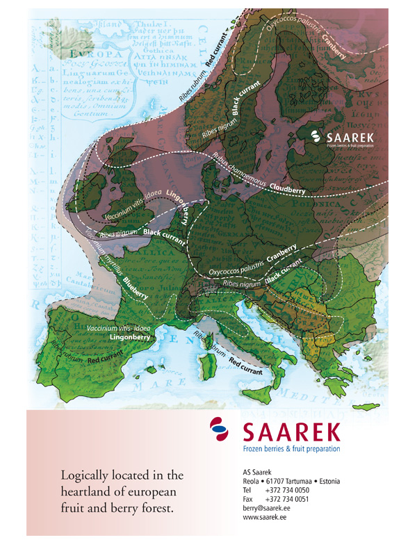
Excellent location is an important competitive advantage of Saarek – as Estonia is located in a region ideal for production many of the most popular fruit and berries. To emphasise this, to show product range and to show EU target markets, the natural growing areas for fruit and berries was overlaid as contours on a map of Europe. Rather than a typical map with familiar name labels for each country, an ancient map of European language names was used to provide texture and encourage detailed inspection.

