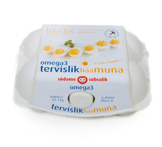
23/04/2018
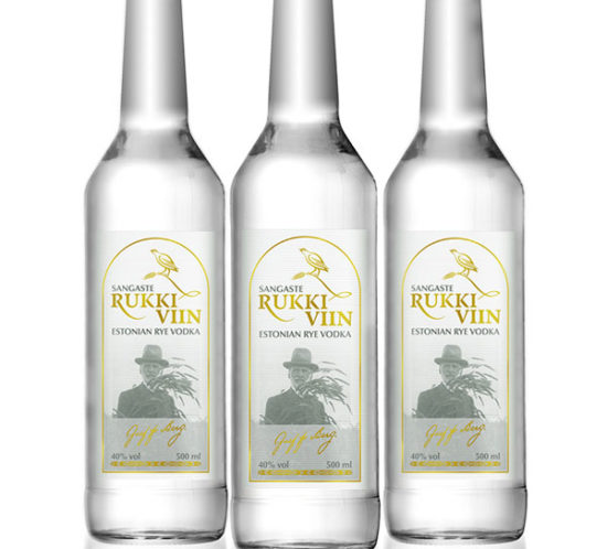
Sangaste rukki viin – pudeli etikett disain
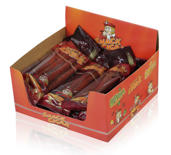
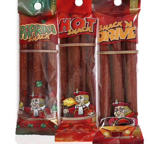
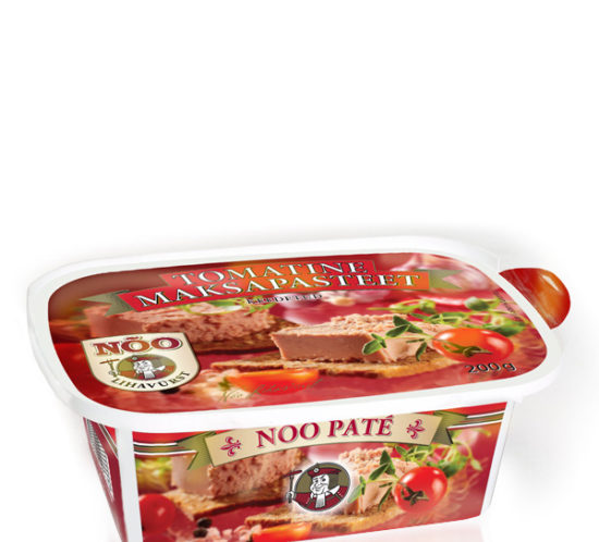
[vc_row row_type="row" type="full_width" icon_pack="font_awesome" content_menu_fe_icon="arrow_back" text_align="left" padding_top="20"][vc_column][vc_column_text] Several years ago I designed a logo and visual identity for Sangaste Rukkimaja guesthouse. Now the client wished to introduce it’s own brand of Rye Vodka and needed packaging for this colourless liquid. To keep printing costs down we...