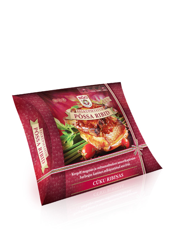
The “pillow pack” used curves of the fold to give rigidity to the pack structure – also, from a production point of view, it is easy to pack the product into.
As a development of the idea that food packaging should look good on the table, I suggested that we make it like a gift pack. The ribbon element of logo colours (red, white, black, gold) has been used on Nõo Lihavürst packaging for many years. Here, I made it into a ribbon seeming to wrap around the pack and tied in a bow knot.
The overall design is very close to that of the established style for barbeque grill products. Again, this shows the ability of a well-thought-out design concept to adapt to new branding situations.


