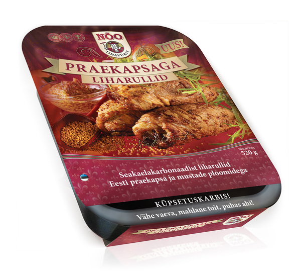
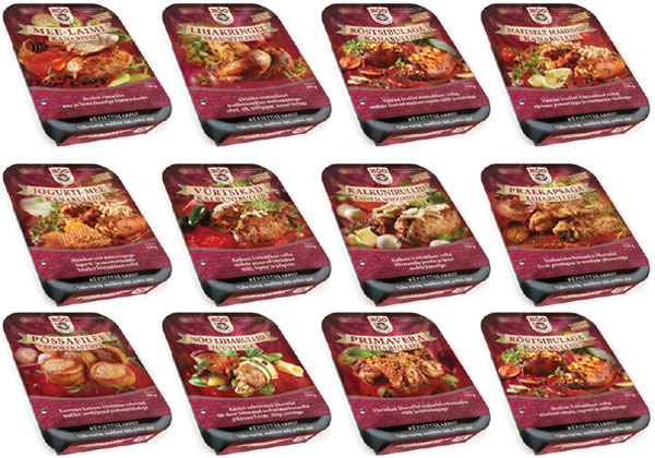
A distinguishing aspect of the branding for Nõo Lihavürst is the style of specially commissioned serving suggestion photos. As art director for the packaging, I specify to the photographer how composition must fit into the space available between branding elements. Occasionally I need to do some Photoshop magic to improve composition or to replace one ingredient with another.
As part of the royal associations with the brand, a “fleur-de-lis” repeat pattern has been used, more recently created as a burgundy red curtain which is used on all packaging. This background is carefully blended with the top of the serving photo – the result is that while each pack has a different serving photo, the top of all packs shows a consistent background for the logo and product name.
While the pack design is almost identical to the range of spring/summer grill meats, the autumn/winter ready meals packs are differentiated by the black front edge mimicking the PET tray edge and the text “Cooking tray”.


