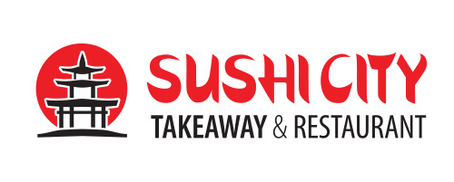

The client for the SUSHI CITY logo and brandmark design had a clear requirement for a red rising sun and Japanese style symbol. We agreed that a 2 colour, red and black design would be best and that the symbol must be possible to print in small sizes.
The symbol in the brandmark design is a stylised drawing of Japan’s oldest three-storeyed pagoda silhouetted against a red circle. For a westerner, the symbol resembles the Kanji Japanese logographic Chinese “Han character” such as 塔 meaning “pagoda”.
The lettering for the SUSHI CITY brandmark is based on Japanese calligraphy but for a Latin alphabet.
The SUSHI CITY brandmark now has a number of takeaway restaurants in southern Estonia.