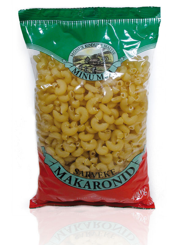
This range of low cost pasta would compete well on price – so the design objective was to create a pack fitting with the mainstream pasta packs. For example, typical past colours are used.
The pack design is closely integrated with the rondelle shape of the brand mark carrying a pastoral illustration also created by Emajõe Disain.


