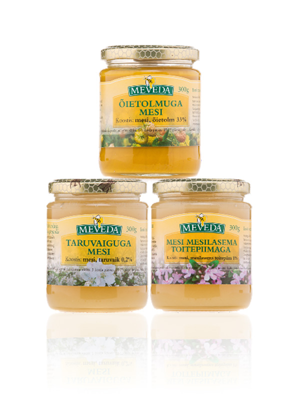
The Meveda honey logo was designed in 3 colours, two of which are used to create a simple, friendly graphic element of a bee, honeycomb and honey drop. In fact, a fourth colour is also used: white – but this lack of colour comes for free! A square element is used in the background to carry the word “mesi” meaning “honey”.
When the company logo is used as a brandmark on a jar, then the word “honey” is no longer needed. As this brandmark would be used widely on curved jars or bottles, I created the brandmark text in an arc – this has the visual effect of adding volume to the container and helping the brandmark to stand out. Centering the symbol relative to the text, was also logical for packaging label design.