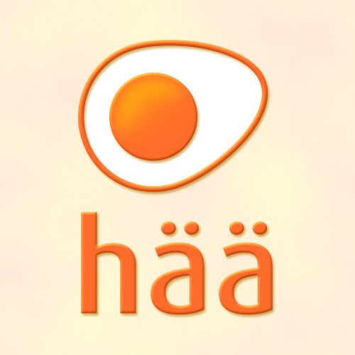
Emajõe Disain was asked to suggest a new brand name for fresh eggs specific to the Estonian market. While brainstorming and thinking from the customers’ point of view, I explored the idea of a “good” egg. Somehow I knew that “hää” means “good” in the colloquial Võru dialect of Estonian so that using “hää” would suggest the local, southern Estonian origin of the eggs.
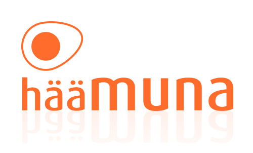
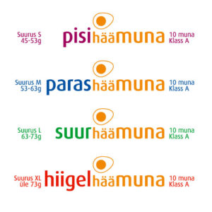
So “hää” was proposed as the anchor of the branding solution as it has all the right associations. The brand name “häämuna” meaning “good egg” was registered as a brandmark. This “hää” combined with size and the word egg then resulted in a brand family: “pisi-, paras-, suur-, hiigelhäämuna” meaning “small, just right, big and really big” as extensions of the brand name.
The directness, simplicity and strength of this brand name solution were extended to the minimalistic design of the egg symbol for the hää brandmark. The simplicity of the brandmark, plus the colloquial familiarity suggest an honesty and brandmark which can be trusted.
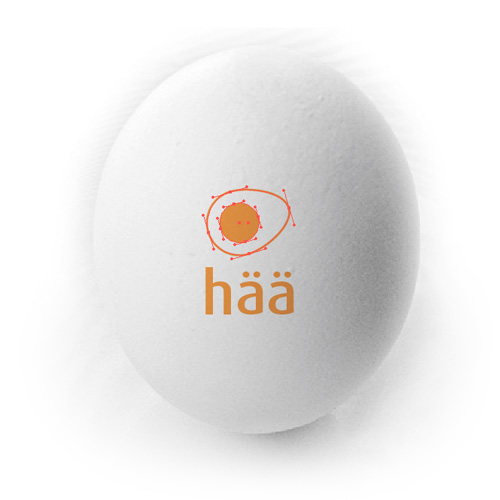
The symbol can be visually interpreted both as an eggshell and yolk in cross-section (like when scanned in light for quality control) or as a fried egg cooking a saucepan. The brandmark is easy to print as one colour on recycled egg cartons, or in small sizes for example on an egg logo and date stamp.