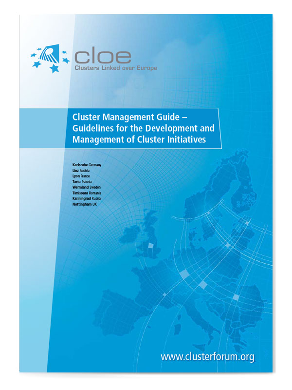
For the front cover design of this conference folder I needed to find a way to illustrate and promoted the intangible concept of Clusters Linked over Europe. Also, a map would be needed to explain the location of these regions.
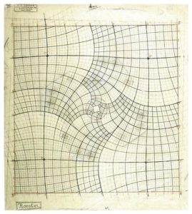
I decided to make the map the cover feature, so used an outline map of Europe, overlaid with a curving grid to suggest the multiple (and more than just geographical) inter-linkages between the 8 regions involved in the project. Perhaps it was the word “guidelines” in the brochure title which inspired me to use the Escher’s “Print Gallery” recursive grid, a device often used in the continuous, repeating illustrations made by Escher.


