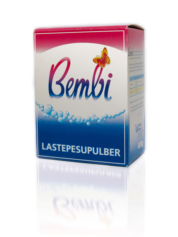
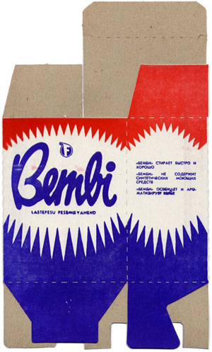
This is one of my very early pack designs in Estonia yet is still a favourite. Designed in 1997 it closely follows the basic formula of the original Bembi pack.
The original was so harsh it looked more like some Andy Warhol oven cleaning product – but the redesign really softened this, adding bubbles and changing the red to a pink while softening the blue to a more child-friendly colour. These colours also suggested washing both at hot and cold temperatures, whites or colours.
The previous typography of the brand name was retained for continuity but the B letter was morphed into a butterfly shape to suggest a delicate, friendly product. Baltic and Russian languages on the sides.


