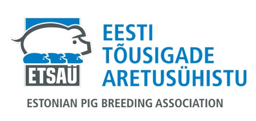
The logo design for the Estonian Pig Breeding Association needed to be able to carry a lot of text: the Estonian full name, abbreviation and English translation.
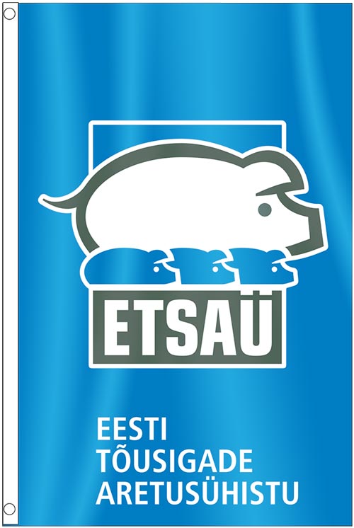
The graphic design solution combines the symbol with the abbreviation as a single unit, around which other text can be composed as needed.
The symbol itself is a logical choice: a stylised line drawing of eye, ear, nose, tail and body, each with subtle curves to bring out the distinguishing characteristics of a pig. The smaller repetition of this as piglets suggest generations of duplication (breeding).


