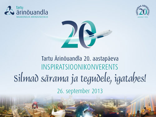
I designed the original Tartu Ärinõuandla (Tartu Business Advisory Services) logo way back in 1993. An abstracted A symbol was designed like a propeller suggesting dynamic synergy. The logo typeface was updated in a visual identity refresh a few years ago.
In 2013 it was the 20th year anniversary of this enterprise support organisation. A ‘tag-on’ 20 mark was designed with the 3D shape on the numerals mimicking the rotating energy in the symbol of the main logo.
The Tartu Ärinõuandla website was also updated including a photo montage by Emajõe Disain.


