Jõudluskontrolli Keskus
This was a case where a client suspected that their existing logo had some problems – after reading my brief report they agreed it was so problematic that a complete redesign was essential.
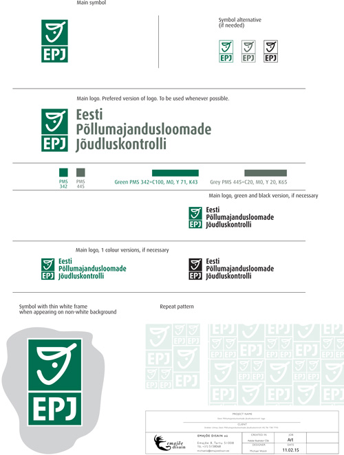
While officially named “Jõudluskontrolli Keksus” the organisation was widely known as JKK so I proposed including this in the symbol – this simple, logical identification was already a major step forward from the previous logo.
The symbol of a stylised farm animal is reminiscent of marks made with livestock branding irons. The solution for the visual identity was built around 2 versions of the logo – the full version with text in Estonian and English, and a “shorthand” version where the symbol alone including JKK could be used for identification.
A long list was made of all places where the identifier would be needed – this included a new website and email address to include the letters jkk. The minimum reproduction size was found to be the farm animal ear tag.


